Tech
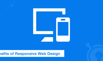
Optimizing User Experience Across Devices: The Power of Responsive Web Design

In the present digital era, where users interact with websites across a multitude of devices, responsive web design has emerged as a vital component in establishing a thriving online presence. With the proliferation of smartphones, tablets, and different screen sizes, websites need to adapt seamlessly and provide an optimal user experience across all devices.
In this blog, we will delve into the concept of responsive web design and explore its significance in optimizing user experience.
Benefits of Responsive Web Design:
Responsive web design has the following benefits:
1. Consistent User Experience
A responsive web design ensures that visitors have a consistent and seamless user experience regardless of the device they use to access the website. Whether it’s a desktop computer, a smartphone, or a tablet, the website automatically adjusts its layout, content, and functionality to fit the screen size, resulting in an enjoyable and intuitive browsing experience.
2. Improved Mobile-Friendliness
With the increasing number of users accessing the internet through mobile devices, having a mobile-friendly website is no longer optional—it’s a necessity. Responsive web design guarantees that your website appears and operates seamlessly on smartphones and tablets, delivering an optimal user experience. It eliminates the need for separate mobile sites and improves search engine rankings, as search engines favor mobile-friendly websites.
3. Flexibility and Cost-Effectiveness
Responsive web design offers a flexible solution for website owners, as it eliminates the need to create and maintain multiple versions of a website. With a responsive design, updates, and changes can be implemented more efficiently, saving time and resources. Additionally, responsive design future-proofs your website, ensuring it remains compatible with new devices and screen sizes that emerge over time.
4. Positive Impact on SEO
Effective search engine optimization (SEO) is paramount to ensure the visibility and success of a website. Responsive design plays a significant role in SEO, as search engines prefer mobile-friendly websites and consider responsiveness as a ranking factor. By adopting responsive web design, you can enhance your website’s visibility in search engine results pages and attract more organic traffic.
5. Enhanced User Engagement and Conversion Rates
A responsive web design contributes to improved user engagement and higher conversion rates. When users can easily navigate and interact with your website on any device, they are more likely to stay longer, explore your content, and take desired actions. Whether it’s making a purchase, submitting a form, or donating to a cause, a seamless user experience across devices encourages user engagement and boosts conversion rates.
Conclusion
In conclusion, responsive web design is essential for optimizing user experience across devices. Whether you’re embarking on a Drupal 9 migration or a nonprofit website design, incorporating responsive design into your web development strategy is crucial. It ensures a consistent user experience, improves mobile-friendliness, offers flexibility and cost-effectiveness, positively impacts SEO, and enhances user engagement and conversion rates. By prioritizing responsive web design, you can create a website that adapts seamlessly to different devices, providing visitors with a delightful browsing experience.


Top 5 Benefits of Hiring Reliable House Cleaners in Melbourne

How to Remove Personal Data from Data Brokers

Bridging the Gap: Challenges and Solutions for Multilingual Events in KenyaBridging the Gap: Challenges and Solutions for Multilingual Events in Kenya

How to Choose the #1 Ranked Phone Data Service Platform

Affordable Virtual Assistant

Effective WordPress Maintenance and Brand Revamping: Key Strategies for Success

iPhone 15 Pro Max Price in Pakistan: A Comprehensive Review

Exotic Escapes: Unveiling the Most Exclusive Villas in North Goa

Top Small Business Bank Accounts in the UK: Find Your Perfect Fit Today

Effective Techniques for Detecting Malicious Code
-

 Blog1 year ago
MyCSULB: Login to CSULB Student and Employee Portal – MyCSULB 2023
-

 Android App3 years ago
Cqatest App What is It
-

 Android1 year ago
What Is content://com.android.browser.home/ All About in 2023? Set Up content com android browser home
-

 Software2 years ago
A Guide For Better Cybersecurity & Data Protection For Your Devices
-
Latest News2 years ago
Soap2day Similar Sites And Alternatives To Watch Free Movies
-
Android2 years ago
What is OMACP And How To Remove It? Easy Guide OMACP 2022
-
Android3 years ago
What is org.codeaurora.snapcam?
-
Business2 years ago
Know Your Business (KYB) Process – Critical Component For Partnerships